WebMD
Reducing confusion & boosting discoverability by 40% for first-time users
Role
Product Design & Research
Team
Shriya Chipde - PD & UXR
Shayla Singh - PD & UXR
Jasmine Chen - PD & UXR
Timeline
Jan - May (2025)
Skills
Product design
Prototyping
Usability Testing


WebMD Health Services
Reducing confusion & boosting discoverability by 40% for first-time users
Role
Product Design & Research
Team
Shriya Chipde - PD & UXR
Shayla Singh - PD & UXR
Jasmine Chen - PD & UXR
Timeline
Jan - May (2025)
Skills
Product design
Prototyping
Usability Testing


CONTEXT
WedMD wanted to test a new iteration of their mobile app homepage
WebMD Health Services is a digital well-being platform offered by employers and health plans to support their members’ physical, mental, and emotional health.
But...
PROBLEM
Users were unsure of where to start or what to do next
The homepage failed to guide users on how to browse the app. They felt like they got dropped in the middle of the map without directions.

So how did we reach here?
I feel like I need to memorize
the app first
There are so many icons. Do I need to know them all?
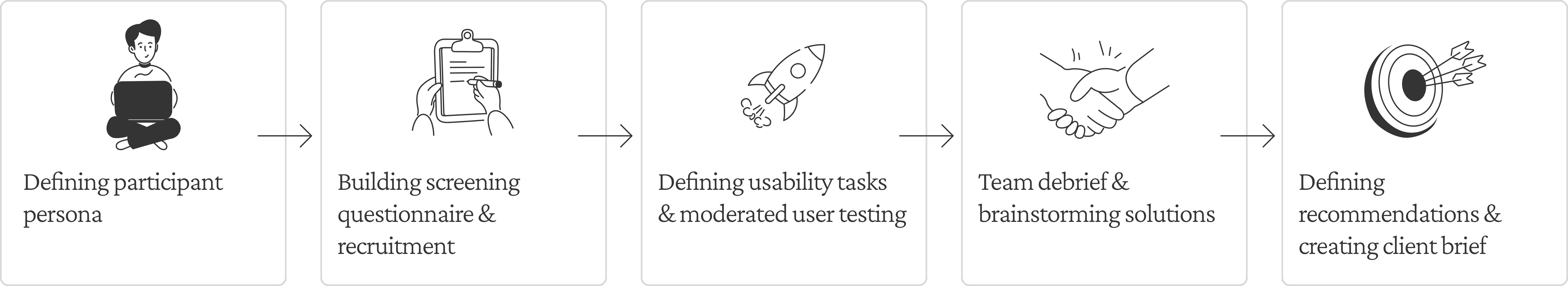
APPROACH
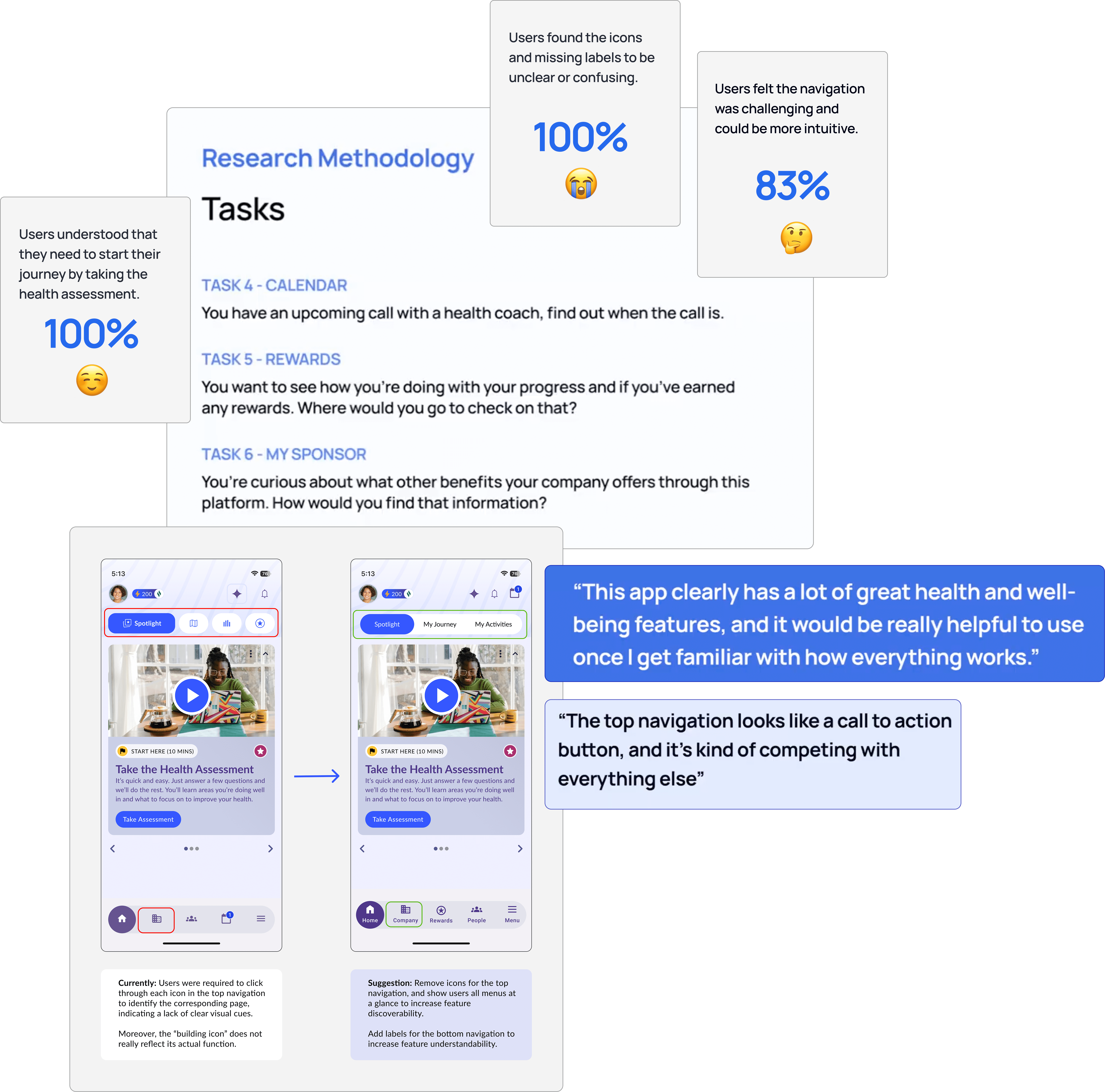
We conducted 16 usability tests & found 3 key issues for why the homepage failed to guide users
RESEARCH GOALS
Understand how users interpret next steps within the experience
Observe how users navigate to key features or sections
Explore what supports or slows their progress toward goals
Assess how clearly information is communicated & understood
RECOMMENDATION 01
Option 1: Minimize the use of icons
Before

Users had to memorize what each icon meant in order to navigate the app
After

So we removed icons from the top nav and displayed the labels for easier navigation
or…
Option 2: Update icons to reduce cognitive overload and improve memorability
Before

Current my journey icon gave users the impression of a map functionality for locating places
Current featured icon was already in use to represent recommended actions. But it was re-used here for a section of articles and media relevant to health
After

Introduced new icon as per user feedback
Re-used an icon that was relevant to content so it promotes memorability
PAINPOINT 01
16/16 of users found icons to be unclear and over-used
Core features were represented by abstract or misleading icons with no labels, forcing users to guess their meaning.

There are too many icons for me to remember for navigating the app.
PAINPOINT 02
13/16 of users struggled with the unlabeled icons, leading to frequent errors.
Without labels, users kept forgetting what each icon meant and had to keep tapping around to find what they needed.

I'm just tapping every icon until I finally find what I’m looking for
RECOMMENDATION 02
Add labels to bottom navigation to reduce errors and constant backtracking
Before
The absence of labels increased guess-work and led to errors in navigation
After
So we added labels to the bottom nav to help users navigate with clarity
PAINPOINT 03
12/16 of users found the homepage to be underutilized
Aside from the health assessment prompt, the homepage didn’t surface any other helpful actions or personalized content.

There’s so much more in the app. Why isn’t that easier to find?
RECOMMENDATION 03
Quick access tiles for popular features of the app on the home page
Before
The home page lacked guidance for next steps and quick access to key features
After

So we added personalized quick-access tiles and reduce reliance on the navigating separately to each tab
PAINPOINT 04
16/16 of users relied on trial-and-error to find features
Aside from the health assessment prompt, the homepage didn’t surface any other helpful actions or personalized content.
Coaching
Coaching classes
Choose your adventure
Health goals
Health record
Health trackers
I didn’t even realize there was a benefits section until you mentioned it.
Before
Users were unable to find key features like coaching and rewards since they were buried within deep complex menus
After

So we moved the search bar from the hamburger menu to the home screen to for allow quick discovery
CLIENT FEEDBACK

LEARNINGS
Small issues add up.
Early on, I assumed the design was self-explanatory. Watching users struggle with icons, navigation labels, and unclear feedback quickly proved otherwise. It was a good reminder that even small usability issues can ripple into bigger frustrations. What stood out most was how often users found clever workarounds, like tapping random icons just to get unstuck, which said a lot about how forgiving users can be when a product feels confusing but still promising.
Assumptions ≠ understanding.
This project pushed me to be more intentional about testing small decisions early instead of polishing visuals first. The sessions made me appreciate the value of observation over assumptions and how real insights come from watching where people hesitate, not from where I think they will.
But...
PROBLEM
Users were unsure of where to start or what to do next
The homepage failed to guide users on how to browse the app. They felt like they got dropped in the middle of the map without directions.
There are so many icons. Do I need to know them all?
So how did we reach here?
I feel like I need to memorize
the app first
CONTEXT
WedMD wanted to test a new iteration of their mobile app homepage
WebMD Health Services is a digital well-being platform offered by employers and health plans to support their members’ physical, mental, and emotional health.
RESEARCH PROCESS
RESEARCH GOALS
Understand how users interpret next steps within the experience
Observe how users navigate to key features or sections
Explore what supports or slows their progress toward goals
Assess how clearly information is communicated & understood
APPROACH
We conducted 16 usability tests & found 3 key issues for why the homepage failed to guide users
RECOMMENDATION 01
Option 1: Minimize the use of icons
Before
Users had to memorize what each icon meant in order to navigate the app
After
So we removed icons from the top nav and displayed the labels for easier navigation
or…
Before
Current my journey icon gave users the impression of a map functionality for locating places
Current featured icon was already in use to represent recommended actions. But it was re-used here for a section of articles and media relevant to health
After
Introduced new icon as per user feedback
Re-used an icon that was relevant to content so it promotes memorability
Option 2: Update icons to reduce cognitive overload and improve memorability
PAINPOINT 01
16/16 of users found icons to be unclear and over-used
Core features were represented by abstract or misleading icons with no labels, forcing users to guess their meaning.
There are too many icons for me to remember for navigating the app.
RECOMMENDATION 02
Add labels to bottom navigation to reduce errors and constant backtracking
Before
The absence of labels increased guess-work and led to errors in navigation
After
So we added labels to the bottom nav to help users navigate with clarity
PAINPOINT 02
13/16 of users struggled with the unlabeled icons, leading to frequent errors.
Without labels, users kept forgetting what each icon meant and had to keep tapping around to find what they needed.
I'm just tapping every icon until I finally find what I’m looking for
RECOMMENDATION 03
Quick access tiles for popular features of the app on the home page
Before
The home page lacked guidance for next steps and quick access to key features
After
So we added personalized quick-access tiles and reduce reliance on the navigating separately to each tab
PAINPOINT 03
12/16 of users found the homepage to be underutilized
Aside from the health assessment prompt, the homepage didn’t surface any other helpful actions or personalized content.
There’s so much more in the app. Why isn’t that easier to find?
CLIENT BRIEFING
How we brought everything together and shared what we learned with the client.
CLIENT FEEDBACK
RECOMMENDATION 04
Bring out the search bar from the contextual menu to the home page
Before
Users were unable to find key features like coaching and rewards since they were buried within deep complex menus
After
So we moved the search bar to the home screen to for allow quick discovery
PAINPOINT 04
Coaching
Coaching classes
Choose your adventure
Health goals
Health record
Health trackers
16/16 of users relied on trial-and-error to find features
Aside from the health assessment prompt, the homepage didn’t surface any other helpful actions or personalized content.
I didn’t even realize there was a benefits section until you mentioned it.
LEARNINGS
Small issues add up.
Early on, I assumed the design was self-explanatory. Watching users struggle with icons, navigation labels, and unclear feedback quickly proved otherwise. It was a good reminder that even small usability issues can ripple into bigger frustrations. What stood out most was how often users found clever workarounds, like tapping random icons just to get unstuck, which said a lot about how forgiving users can be when a product feels confusing but still promising.
Assumptions ≠ understanding.
This project pushed me to be more intentional about testing small decisions early instead of polishing visuals first. The sessions made me appreciate the value of observation over assumptions and how real insights come from watching where people hesitate, not from where I think they will.
APPROACH
We conducted 8 usability tests & found 4 key issues for why the homepage failed to guide users
RESEARCH GOALS
Understand how users interpret next steps within the experience
Observe how users navigate to key features or sections
Explore what supports or slows their progress toward goals
Assess how clearly information is communicated & understood
RESEARCH PROCESS
PAINPOINT 01

8/8 of users found icons to be unclear and over-used
Core features were represented by abstract or misleading icons, forcing users to memorize what the icons meant.
Do I need to remember all icons to navigate the app?
RECOMMENDATION 01
Option 1: Minimize the use of icons
Before
Users had to memorize what each icon meant in order to navigate the app
After
So we removed icons from the top navigation and displayed the labels for easier navigation
or…
Option 2: Update icons to reduce cognitive overload and improve memorability
Before
The current my journey icon gave users the impression of a map for locating places
Current featured icon was already in use for recommended actions. But it was re-used here for a section of articles and media relevant to health
After
Introduced new icon for my journey that is represents a section for user progress
Re-used an icon for featured that was used to indicate a content section so it promotes memorability
PAINPOINT 02
6/8 of users struggled with the unlabeled icons, leading to frequent errors.
Without labels, users kept forgetting what each icon meant and had to keep tapping around to find what they needed.
I'm just tapping every icon until I finally find what I’m looking for
RECOMMENDATION 02
Add labels to bottom navigation to reduce errors and constant backtracking
Before
The absence of labels increased guess-work and led to errors in navigation
After
So we added labels to the bottom nav to help users navigate with clarity
PAINPOINT 03
5/8 of users found the homepage to be underutilized
Aside from the health assessment prompt, the homepage didn’t surface any other helpful actions or personalized content.
There’s so much more in the app. Why isn’t that easier to find?
RECOMMENDATION 03
Quick access tiles for popular features of the app on the home page
Before
The home page lacked guidance for next steps and quick access to key features
After
So we added personalized quick-access tiles and reduce reliance on the navigating separately to each tab
PAINPOINT 04
Coaching
Coaching classes
Choose your adventure
Health goals
Health record
Health trackers
8/8 of users relied on trial-and-error to find features
Aside from the health assessment prompt, the homepage didn’t surface any other helpful actions or personalized content.
I didn’t even realize there was a benefits section until you mentioned it.
RECOMMENDATION 04
Bring out the search bar from the contextual menu to the home page
Before
Users were unable to find key features like coaching and rewards since they were buried within deep complex menus
After
So we moved the search bar to the home screen to for allow quick discovery
CLIENT BRIEFING
How we brought everything together and shared what we learned with the client.
CLIENT FEEDBACK
MY LEARNINGS
Small issues add up.
Early on, I assumed the design was self-explanatory. Watching users struggle with icons, navigation labels, and unclear feedback quickly proved otherwise. It was a good reminder that even small usability issues can ripple into bigger frustrations. What stood out most was how often users found clever workarounds, like tapping random icons just to get unstuck, which said a lot about how forgiving users can be when a product feels confusing but still promising.
Assumptions ≠ understanding.
This project pushed me to be more intentional about testing small decisions early instead of polishing visuals first. The sessions made me appreciate the value of observation over assumptions and how real insights come from watching where people hesitate, not from where I think they will.
How about another read?
Academic project
Mobile design
Helping newcomers build a sense of belonging through gamified city exploration
How about another read?
Academic project
Mobile design